Nobody thinks they are making these mistakes.
That is actually the problem. The rooms that look the most off are usually the ones where the most effort went in. People spend months choosing furniture, painting and repainting, rearranging things on weekends. And the room still feels wrong. Not ugly exactly. Just... not right. Like something is missing but you cannot identify what.
I have walked into hundreds of living rooms over the course of my career. The ones that feel genuinely expensive rarely have more money in them than the ones that feel cheap. The difference is almost always a collection of small, specific mistakes that compound each other. Fix three or four of them and the room shifts. Fix ten and it becomes unrecognizable.
These are the twenty I see most often in 2026. Some of them will surprise you. A few honest notes before we start. I am not going to be polite about some of these because polite design advice is how people end up with the same wrong choices for years. And I am going to tell you when I have made these mistakes myself, because I have, and you should know that even people who do this professionally get it wrong sometimes.
Mistake 1: The Rug Is Too Small
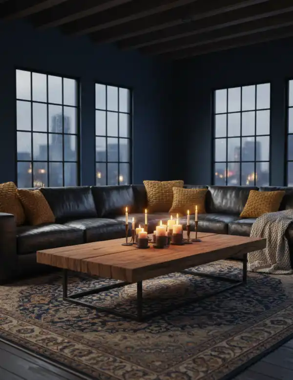
This is the single most common mistake I see. By a significant margin. A rug that is too small does not just look wrong on its own. It makes every other piece of furniture in the room look wrong too. The sofa floats. The chairs float. Nothing is anchored. The room reads as a collection of individual objects rather than a composed space.
The correct size for a living room rug: in a standard room with a sofa and two chairs, the front legs of every seating piece should sit on the rug. All of them. If that requires an 8x10 rug and you bought a 5x7, the 5x7 is wrong regardless of how much it cost or how beautiful the pattern is.
I had a client once who bought a beautiful hand-knotted wool rug, spent real money on it, and the room looked worse after she put it in than before. The rug was 5x8. We moved it into the hallway, ordered a 9x12 in a simpler pattern for half the price, and the room looked twice as good immediately.
Mistake 2: All the Furniture Is the Same Height
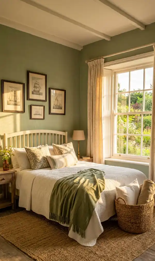
Walk into a room where every piece of furniture is approximately the same height and something feels immediately flat. You might not be able to name it. But you feel it. In 2026 specifically, the move is toward low-profile silhouettes as the dominant seating level, which means the variation needs to come from other sources: tall plants, floor lamps, full-height shelving, or art hung higher than feels instinctive. The low sofa needs the tall lamp. Without it the room sinks.
What to do instead: audit the heights in your room. If everything sits between 70 and 95 centimeters, add something that goes to 150 or above. A floor lamp, a tall ceramic, a plant. The specific object matters less than the height it introduces.
Mistake 3: The Sofa Is Pushed Against the Wall
This one is counterintuitive and I understand why people do it. Pushing the sofa against the wall feels like it creates more floor space. It does not. It creates more awkward empty floor space in the middle of the room and makes the seating feel like it is waiting for something rather than participating in it.
I pushed my own sofa against a wall for two years in an apartment before I finally pulled it out and floated it. I spent two years wondering why the room felt like a waiting area. The answer was 40 centimeters.
What to do instead: pull the sofa 30 to 45 centimeters from the wall. If the room feels too small to do this, the sofa is probably too big for the room. A smaller sofa floated correctly will always feel better than a larger sofa against the wall.
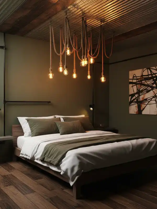
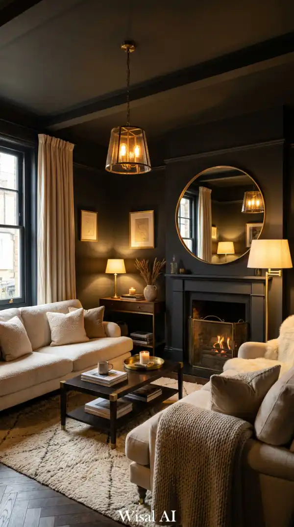
Mistake 4: One Central Light Source
A single overhead light in a living room is not a lighting scheme. It is a starting point that someone forgot to finish.
One overhead light does three things. It creates unflattering downward shadows on every face in the room. It illuminates the room evenly, which means it creates no atmosphere at all. And it makes the ceiling the brightest point in the room, which is precisely the opposite of where you want attention to go.
Layered lighting is not complicated. You need three sources at different heights. A floor lamp in one or two corners. Table lamps on side tables or the console behind the sofa. The overhead fixture on a dimmer so it can be brought down when the other sources are on. The specific target is 2700K or lower for all sources in a living room. Not 3000K. Not 4000K. 2700K reads as warm, inviting, and expensive. 4000K reads as a medical waiting room.
Mistake 5: The Coffee Table Is the Wrong Size
Too small and the seating arrangement looks like it is orbiting a coaster. Too large and nobody can get around it comfortably and the room feels like an obstacle course. The correct proportion for a coffee table: it should be roughly two thirds the length of the sofa. So a 240 centimeter sofa should have a table around 150 to 160 centimeters long. The height should be level with or slightly lower than the seat cushion height of the sofa, not above it.
What to do instead: measure your sofa, calculate two thirds of its length, and use that as your starting point for table size. Then choose the shape based on what the rest of the room needs, not just what looks nice in isolation in a shop.
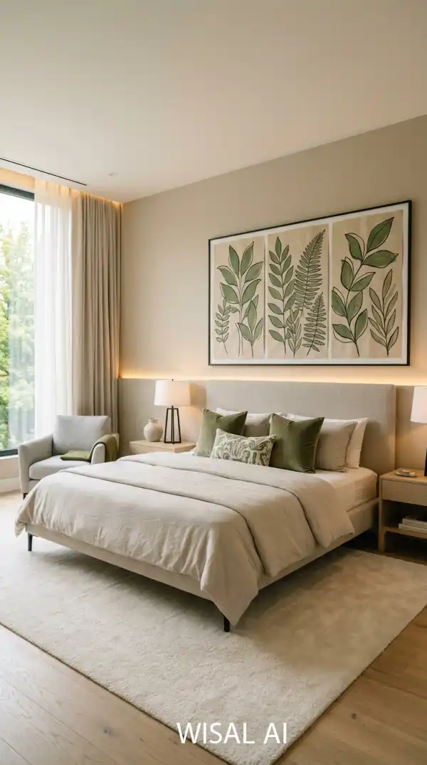
Mistake 6: Art Hung Too Low
This is the mistake I can spot from across the street when I can see through a window. Art hung at eye level sounds correct. It is not. Eye level while standing is around 155 to 165 centimeters from the floor. Art hung at eye level while standing reads as low and disconnected from the ceiling, especially when the room has high ceilings. It makes the wall look like it has a horizontal band of things stuck to its lower half with nothing happening above.
The correct center height for art in most rooms is around 145 to 150 centimeters from the floor to the center of the piece, not the top, the center. This is actually slightly below standard eye level, which sounds wrong but looks right because it takes into account that people are usually seated when they are in a living room.
For art hung above furniture like a sofa or console, the bottom edge of the art should sit 15 to 25 centimeters above the top of the furniture. Not 5 centimeters. Not 50. 15 to 25. What to do instead: before you put a single nail in the wall, use painter's tape to mark out the exact position of the art. Step back. Sit down on the sofa and look at it. Adjust before you commit.
Mistake 7: Too Many Small Decorative Objects
I call this the accumulation problem. It is almost invisible while it is happening. A candle here. A small sculpture there. A bowl from a trip. Another candle because the first one burned down. A vase because it was on sale. A decorative tray to organize the objects that are already there. More objects in the tray.
At some point the surface stops being a surface and becomes a storage unit. Everything on it cancels everything else out. No single object is able to be looked at because there is always something competing with it.
The editing test I use: remove everything from the surface. Put back only the things you would be genuinely upset to lose. Usually that is two or three objects maximum per surface. Everything else can find another home.
What to do instead: edit ruthlessly. One surface, maximum three objects. Two is usually better. One is sometimes perfect.
Mistake 8: Matching Everything Too Perfectly
A fully matched living room, where the sofa fabric matches the curtains matches the cushions matches the rug, is a room designed by someone who was afraid to make a decision.
This is harder than buying a set. It requires actual decisions about what works with what. But it produces rooms that feel like they were put together by a person rather than by a furniture store. What to do instead: start with one anchor piece that you genuinely love. Build everything else around it, not by matching it, but by finding pieces that have a conversation with it.
Mistake 9: Curtains That Do Not Reach the Floor
Short curtains are the design equivalent of trousers that end above the ankle. Technically functional. Visually wrong. Curtains that hang to just below the windowsill, or that stop a foot above the floor, do two things. They cut the wall into a horizontal band, creating a visual interruption that makes the ceiling feel lower. And they draw attention to the floor space between the curtain hem and the ground, which is always an awkward void that the eye does not know what to do with.
What to do instead: replace short curtains with floor-length ones. Mount the rod at ceiling height. The curtains can be simple and inexpensive. The length and rod position do most of the work.
Mistake 10: The Room Has No Focal Point
Every room needs one thing that the eye goes to first. One anchor. One point of arrival. Without a focal point, the eye moves around the room without ever landing anywhere. This reads as restlessness. The room feels unresolved. People say it feels like something is missing and they are right. What is missing is hierarchy. What to do instead: decide what your focal point is before you do anything else in the room. Every other decision should support it rather than compete with it.
Mistake 11: Furniture That Is Too Big for the Room
Big furniture in a small room does not make the room feel larger. It makes the furniture feel like it was moved in from a different life and left there by accident. The room will never feel right until the sofa is the right size. No amount of other design work compensates for furniture that is proportionally wrong.
What to do instead: measure the room before you buy anything. Not roughly. With a tape measure. Mark the furniture footprint on the floor with painter's tape before purchase if necessary.
Mistake 12: Ignoring the Ceiling
The ceiling is 20 percent of the surface area of a room and most people treat it as a structural necessity rather than a design element. A white ceiling in a room with white walls and white trim is a room that has not been designed. It has been primed and left.
What to do instead: look up at your ceiling. Decide what you want to do with it. That decision alone puts you ahead of most rooms.
Mistake 13: The Sofa Color Is Too Safe
I understand why people choose them. They are safe. They go with everything. They are hard to get wrong. They are also slightly boring in a way that becomes more visible every year. A cream sofa in a room of warm neutrals is a room that hedged every decision. The result is technically fine and genuinely forgettable.
I am not saying everyone should have a colored sofa. A cream sofa in a room where other deliberate color decisions have been made is completely fine. A cream sofa in a room where everything else is also safe is a room that played it too carefully.
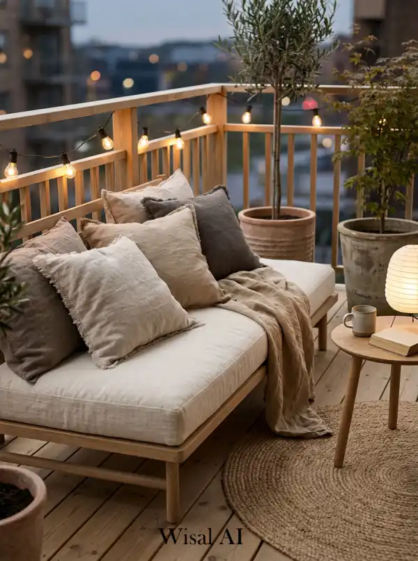
Mistake 14: No Texture Variation
A room where every material has a similar surface quality, smooth sofa, smooth cushions, smooth rug, smooth curtains, reads as flat regardless of how many pieces are in it. Texture creates visual depth. It gives the eye something to move across rather than glide over. And it creates the physical impression of warmth and richness even in rooms with restrained color palettes.
What to do instead: close your eyes and imagine touching every material in the room. If they all feel similar, add something that feels genuinely different.
Mistake 15: Technology Dominating the Room
A large black rectangle mounted on the wall above the fireplace is the most common version of this mistake, and it drives me slightly crazy.
The television mounted above the fireplace requires you to look up at an uncomfortable angle to watch it, which is bad ergonomics. It places a black rectangle at the most visually prominent point in the room, which is bad aesthetics. And it means that even when the television is off, it dominates the room.
What to do instead: if the TV must be on the wall, position it at seated eye level, not above the fireplace. If it must be above the fireplace, get a mount that tilts it to a more comfortable angle. Deal with the cables. This is not optional.
Mistake 16: Plants That Are Too Small
One small succulent on a windowsill is not a plant moment. It is a gesture. And gestures are not design.
Plants earn their place in a living room through scale. A single plant that makes a visual impact is always worth more spatially than ten small plants arranged together. A fiddle leaf fig at 150 centimeters introduces architecture. A collection of small succulents introduces clutter. The second mistake within the plant mistake: choosing plants for visual appeal rather than actual growing conditions. A plant that is dying because it is in the wrong light condition looks worse than no plant at all. A healthy plant in a cheap pot looks better than a beautiful pot with a struggling plant.
What to do instead: identify one position in the room where a large plant would make a genuine visual contribution. Buy the largest healthy version of a plant suited to that light condition. Put it in a pot that is correct in scale and material for the room. One decision, maximum impact.
Mistake 17: Symmetry That Is Too Perfect
Perfect symmetry in a living room reads as corporate. Two identical sofas. Two identical lamps. Two identical cushions on each side. Two identical plants flanking the fireplace. Everything mirrored on both sides of a central axis. It is not wrong exactly. It is just inert. There is no tension in it. No personality. It reads as a room designed to offend nobody, which usually means it inspires nobody.
What to do instead: identify one point of perfect symmetry in your room and deliberately break it. Remove one of the matching pair and replace it with something related but different. See what happens.
Mistake 18: Curtains That Start at the Window Frame
Curtains mounted on a rod that sits directly above the window frame, covering only the glass, are curtains doing the minimum. They block light when closed and frame the window when open. That is all they do.
The correct extension: at least 30 to 45 centimeters beyond the window frame on each side. More if the wall space allows. This is combined with the ceiling-height rod position from Mistake 9. Together these two adjustments turn any window into a significant architectural feature.
What to do instead: when re-hanging curtains, extend the rod at least 30 to 45 centimeters beyond the window frame on each side. Use enough curtain panels that when open they stack almost entirely off the glass, maximizing the visible window area.
Mistake 19: No Negative Space
The impulse to fill every surface, every corner, every shelf, every wall comes from a good place. It looks finished. It looks done. It actually looks full. Full and finished are different things. Full reads as having run out of room. Finished reads as having chosen not to add more.
Negative space, the deliberate absence of objects on a surface, the bare wall beside the art, the empty stretch of floor between the sofa and the wall, these are active design decisions. They give the objects that are present room to be seen. A single good ceramic on a surface is visible. The same ceramic surrounded by five other objects is invisible.
What to do instead: walk around your room and identify three surfaces or areas that could have one object removed. Remove it. Live with the space for a week. If you can, remove another.
Mistake 20: The Room Has No Personal Character
This is the hardest mistake to fix because it is the one nobody wants to admit they have made. A room with no personal character is a room that looks like a furniture showroom or a hotel lobby. Everything is correct. The proportions are right. The lighting is layered. The rug is the right size. And yet the room tells you nothing about the person who lives in it.
Personal character in a room comes from objects that cannot be sourced from a design store. Books that have been read. A piece of art you bought because you loved it, not because it matched the wall color. A ceramic your grandmother made. A chair you had reupholstered because you could not bear to throw it out. A rug brought back from somewhere that meant something.
What to do instead: identify three objects in your home that have a personal story and put them in the living room. Not decoratively arranged. Just there. The room will become more honest immediately.
The Honest Summary
Most of these mistakes share a root cause. They come from decisions made in isolation rather than in relation to everything else in the room.
The rug was bought without measuring. The curtains were hung where it seemed logical. The art went at eye level because that is what people say. The sofa went against the wall because it felt practical. Each decision made a certain amount of sense by itself. Together they produced a room that feels off in ways that are hard to identify.
Design is relational. Every decision affects every other decision. The sofa size affects the rug size. The rug size affects where the furniture sits. Where the furniture sits affects the lighting position. The lighting position affects how the color reads. The color affects everything.
Start by fixing the mistakes that cost nothing or close to nothing: move the sofa away from the wall, rehang the curtains higher, edit the surfaces, fix the art height. These things require no budget. They require only the willingness to see the room as it actually is rather than as you have grown accustomed to it.
What is the single most common living room mistake?
The rug is too small. I see this in almost every room I walk into. A rug that does not extend under the front legs of every seating piece makes the entire furniture arrangement look like it is floating. Get the size right before anything else.
Can I fix these mistakes without a big budget?
Most of them yes. Moving the sofa away from the wall costs nothing. Rehanging curtains higher costs nothing. Editing objects off surfaces costs nothing. Changing light bulbs to 2700K costs almost nothing. The mistakes that require real money are furniture scale and built-in storage. Everything else is a decision, not a purchase.
Why does my living room look expensive in photos but feel cheap in person?
Usually lighting. Photographs flatten the room and hide the absence of texture and depth. In person, the eye reads layering, material variation, and the quality of light in ways the camera does not. Fix the lighting first and the gap between photo and reality closes significantly.
How do I know if my furniture is the wrong size for the room?
The 80 centimeter rule. There should be at least 80 centimeters of clear walking space around every piece of furniture. If you cannot achieve this, something is too large for the space it is in.
Is it really a mistake to match everything?
Not exactly a mistake — more like a missed opportunity. A fully matched room is technically fine. It just reads as safe, and safe reads as forgettable. The rooms that feel genuinely expensive are almost always assembled from related but non-identical pieces.
What is the fastest single change I can make today?
Move the sofa 40 centimeters from the wall and change every bulb in the room to 2700K. Do both in one afternoon. The room will feel different by evening.