Nobody taught you the real problem. You think your living room feels small because it is small. Wrong. It feels small because the color is lying to your nervous system. Color is not finish. It is not decoration. It is spatial engineering and most people are doing it completely wrong. Here is what actually happens inside your brain: your visual cortex estimates distance by reading the light reflectance value of surfaces. High LRV — the surface appears further away. Low LRV, inconsistently applied — the brain reads fragmentation. Fragmentation reads as confinement. Confinement reads as small.
That is not an opinion. That is how your occipital lobe works. I have been specifying color for small living rooms for years. The ones that feel cramped almost always have the same problem — not bad furniture, not bad proportions. Bad color logic. Fix the logic. The room fixes itself.
In 2026, color drenching — one color across walls, ceiling, and trim — is being used in compact spaces more aggressively than ever before. And the old "just paint it white" school of thought? It is producing rooms that feel like hospital waiting areas.Let me show you what actually works.
The Physics Before the Pretty
Three mechanisms. Understand them. Everything else follows. Light Reflectance Value (LRV). Every paint color has a number from 0 to 100. Pure black is zero. Pure white is 100. Colors above 55 LRV open a room. Colors below 30 LRV used without discipline compress it. This is not aesthetic preference. This is optics.
Tonal continuity. Every time the eye hits a contrast — where the wall meets the white ceiling, where the dark baseboard interrupts the wall — it registers a boundary. Boundaries mean edges. Edges mean the room ended. Kill the contrasts. The room keeps going. Chromatic depth. A very dark color applied to all surfaces simultaneously removes the visual cues that tell your brain where the walls are. The room does not feel dark. It feels boundless. This is why the best hotel bars feel larger than their floor plan suggests. It is deliberate.
20 Colors. Real Opinions. No Filler
1. Warm White Not Boring. Cowardly When Done Wrong.
Everyone defaults to white. I understand why. It is safe. It is reversible. It offends nobody. It also frequently produces nothing. The problem is not white. The problem is which white. Cool whites — anything with a blue or grey undertone — kill wood tones, flatten linen, and turn a small living room into a clinical space where nobody wants to stay. The LRV is high. The warmth is zero. The result is a room that technically reflects light and emotionally repels people.
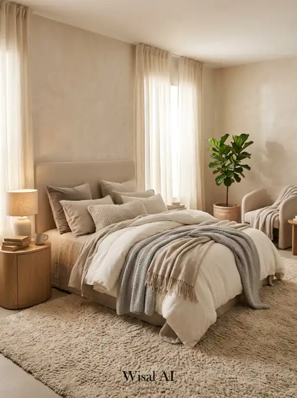
Warm white works. Specifically: whites with yellow or pink undertones, LRV between 80 and 88. These are the whites that make natural oak look richer. That make linen read as deliberate rather than accidental. The field test: Hold your paint sample next to bare wood. If the wood looks warm and alive, you have the right white. If it looks yellowed or tired, your white is too cool.
What I tell clients: I have specified warm white more times than any other color. The reaction when people walk in is always the same — the room feels bigger than they expected. They think I did something clever. I did not. I chose the correct LRV and the correct undertone. Physics did the rest.
Budget reality: This costs the same as any other paint. It delivers more spatial impact than furniture you will spend ten times the money on.
2. Warm Greige The Color That Has No Enemies
Greige is grey and beige arguing and both winning. It sits at the thermal midpoint of the warm-cool spectrum. In strong morning light it reads almost white. At dusk it goes warm and amber. In artificial light it becomes a sophisticated neutral that makes every material placed against it look intentional. This is what architects call chromatic neutrality with thermal bias. The color does not fight anything. It lets the furniture perform.
The mistake people make: choosing a greige that leans cool. The grey dominates. The wood tones flatten. The room goes corporate. The test is the same as with white — hold the sample next to bare oak or walnut. The wood should look expensive, not yellowed.
What I tell clients: Greige is the color of rooms that read as expensive without explaining why. A 12-square-meter living room in the right greige does not feel like a small room. It feels like a room with restraint. Those are different things.
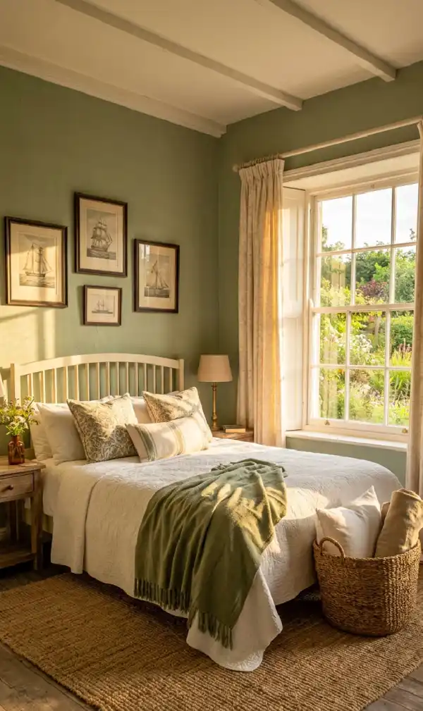
3. Soft Sage Green Mid-Tone Spatial Intelligence
Sage green is not a trend. It is a color that arrived at the right moment and stayed because it solves real problems. Its LRV sits between 45 and 58, depending on the formula. That is the spatial sweet spot for small living rooms — high enough to reflect meaningful light, low enough to have genuine chromatic presence. It does not disappear. It does not dominate. It occupies the room correctly.
What I tell clients: The rooms I most wish I had photographed for my portfolio are sage green rooms. They photograph better than they cost. That ratio matters.
4. Dusty Blue The Color That Recedes on Command
Blue recedes. That is its spatial superpower. Cool-undertone surfaces appear further from the eye than warm surfaces at the same distance. This is not metaphor — it is how wavelength absorption works in human vision.
Material pairing logic: Blue walls need warm-undertone materials to prevent thermal collapse. Wood, linen, jute, rattan. These are not optional suggestions. They are structural. Remove the warmth and the room goes cold.
What I tell clients: I used a dusty slate blue in a living room a client described as claustrophobic. Same furniture, same floor plan. Different color. She said afterward that the far wall looked further away. It was. Optically.
5. Blush and Dusty Rose Spatially Underrated, Chronically Misunderstood
Every male client hesitates. Every time. And every time once it is on the walls, lit correctly, with the right companions — the reaction is the same: "I did not expect it to look like this." Blush works in small living rooms because its LRV is high and its warmth is immediate. It does not fight natural light. It amplifies it. Afternoon sun hits a dusty rose wall and the room goes golden. That is the thermal radiation effect of warm, pink-biased pigments — they absorb blue wavelengths and return warmth
What I tell clients: Blush done correctly does not read feminine. It reads considered. There is a significant difference.
6. Terracotta and Warm Clay Ancient Color. Modern Spatial Logic.
Terracotta is the oldest architectural color on earth. It has survived ten thousand years of design trends because it solves a fundamental human problem: it makes interior space feel inhabited rather than constructed.
In a small living room, terracotta does something technically interesting. Its spectral reflectance curve peaks in the red-orange wavelengths the wavelengths most associated with warmth, proximity, and safety. The room feels occupied. Inhabited. Not small full.
The constraint is light. Terracotta without adequate natural or warm artificial light goes muddy. In a north-facing room, go one value lighter than instinct suggests. In a room with good south or west light, commit fully.
What I tell clients: Terracotta makes guests ask who decorated the space. Not "what color is that?" They already know the color. What they cannot identify is why it looks deliberate. That is the point.
7. Limewash Not a Color. A Performance.
Limewash is not paint. It is mineral pigment suspended in calcium hydroxide, applied in multiple translucent layers. Each layer shifts the optical depth of the wall. What this means spatially: a limewash wall does not have a single color. It has a range. Morning light reads one value. Afternoon reads another. The wall moves throughout the day. In a small living room, a surface that moves is a surface that does not feel like a boundary. The optical depth created by layered mineral pigment is something standard paint cannot produce. It is not about texture in the tactile sense. It is about the perception of depth within the surface itself.
What I tell clients: I have had clients ask if we altered the room's architecture after a limewash application. We did not touch the walls. We changed what the walls communicated.
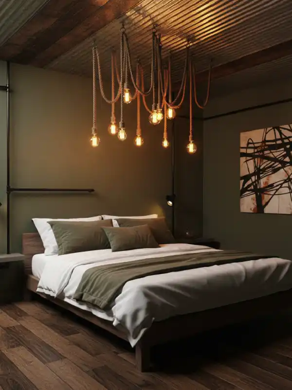
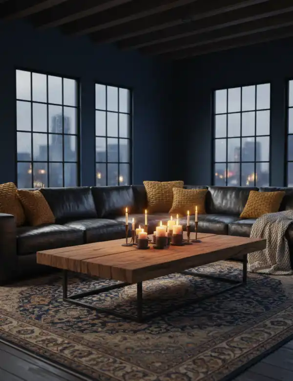
8. Deep Charcoal The Counterintuitive Move That Always Works
Every client argues with me on this one. Fine. I have stopped arguing back. Here is the mechanism: chromatic boundary elimination. When the walls, ceiling, and baseboard trim are all the same deep charcoal, the visual cues that define where the room ends disappear. The eye cannot find the corner. The corner is the problem. Remove the contrast. Remove the corner. The room expands — not physically, optically.
The failure mode is going halfway. One charcoal wall with three white walls does not work. It makes the white walls look larger and flatter and the room look like a mistake. Commit to all surfaces. Then commit to warm lighting — minimum three sources, all 2700K or warmer.
What I tell clients: The photograph I sent one client the day after we completed a full charcoal living room was the most disbelieving I have ever seen. She was not prepared for it to feel larger.
9. Deep Teal Chromatic Recession at Its Most Sophisticated
Teal occupies a unique position in the spectrum for small spaces. It is dark enough to add depth. It recedes because of its cool-blue component. But its green component keeps it from going cold.
The chromatic recession principle that makes dusty blue work applies here at higher intensity. Deeper LRV — around 20 to 35 — creates stronger depth perception. The wall appears further than it is. With teal specifically, the green keeps the room from feeling clinical. It stays warm enough to live in.
What I tell clients: Teal is a commitment. It is also almost always the right commitment.
10. The Ceiling The Surface Everyone Wastes
Stop painting your ceiling white by default. That decision white ceiling, colored walls — creates the most damaging spatial interruption in a small living room. The eye travels up the wall, hits the contrast at the cornice, and registers: edge. End. Boundary. The horizontal plane of the ceiling is a spatial tool. Use it. Two approaches. First: paint the ceiling one LRV value lighter than the walls in the same color family. The tonal continuity eliminates the cornice boundary. The eye keeps moving. The room keeps going. Second: full color drench — ceiling identical to walls. The boundary disappears entirely. The room becomes an environment.
Both work. The second is more dramatic. Both cost the same as painting a ceiling white. What I tell clients: The ceiling is the only surface in the room that costs exactly the same to paint correctly as to paint wrong. There is no excuse for wasting it.
11. Tone-on-Tone The Professional's Spatial Weapon
Tonal continuity is not a stylistic preference. It is a spatial mechanism. When walls, trim, ceiling, and large soft furnishings occupy the same color family at different value intervals, the eye moves continuously across surfaces without registering the transitions between them. No contrast lines. No boundaries. No perceived edges. The room does not end — it continues. This is the monochromatic spatial illusion, and it works without exception. I have applied it to rooms ranging from 9 to 22 square meters. Every single time, the room reads larger after than before.
The formula: lightest value for the ceiling. Light-mid for the walls. Mid for the sofa or large rug. Deepest for accent objects. Five tones. One color family. Total coherence.
What I tell clients: Tone-on-tone looks expensive because it requires decision-making. Most people make four color decisions when they decorate. Tone-on-tone requires twenty. The room knows the difference.
12. Olive Green The Color Photographers Love
Olive green photographs better than it costs. That ratio is rare. Use it. Its LRV sits around 35 to 45 — low enough to have real presence, high enough not to compress the room. Its undertones are split between yellow and brown, which gives it thermal affinity with warm wood tones that cooler greens simply do not have. Walnut looks expensive next to olive green. Oak looks richer. Natural linen reads as deliberately chosen rather than default. The material relationships improve because of the color's undertone structure.
What I tell clients: Olive green rooms are the ones clients photograph most on their phones during site visits. Not the most dramatic rooms. The most livable ones. That is the correct ambition.
13. Navy Blue The Color That Demands Commitment
Navy in a small living room is either completely correct or completely wrong. There is no middle ground. The mechanism is the same as charcoal: chromatic boundary elimination through consistent dark application. The failure mode is also the same: going halfway. One navy wall surrounded by white does not create depth. It creates a room with one angry wall.
The difference between charcoal and navy in small spaces is thermal. Charcoal has neutral undertones. Navy has blue ones — which means it requires warmer companion materials and more deliberate warm lighting to prevent the room from going cold. Minimum three light sources. All 2700K or warmer.
14. Burnt Sienna and Rust The Colors of Inhabited Space
Sienna and rust are the colors that make a room feel like someone has lived in it for twenty years. Not in a worn way. In an earned way. Their spectral reflectance peaks in the red-orange range — the same frequencies as firelight, evening sun, and warm skin tones. The human nervous system does not register these colors as design choices. It registers them as comfort. As heat. As belonging.
In a small living room, this is a spatial advantage. The room does not feel small. It feels concentrated. Intentional smallness rather than accidental smallness — and those are completely different psychological experiences.
15. Mirrors as Color Amplifiers
This belongs in the color conversation because mirrors do not add space. They multiply color. A mirror placed opposite a window does not simply reflect light. It reflects the full chromatic value of the room — the color of the walls, the warmth of the light, the entire spatial character — and returns it from a different angle. The room reads twice as colored. Twice as considered.
The correct mirror for a small living room is large. Ideally floor-to-ceiling, or at minimum 80 centimeters at its shortest dimension. Small mirrors create small effects. Scale is structural. What I tell clients: The mirror is the highest-return investment in small space design. It costs less than a sofa cushion and does more spatial work than a wall of furniture.
16. Color Drenching Total Commitment, Total Reward
Color drenching is not a trend. It is a spatial logic that was waiting for design culture to catch up. One color. Every surface. Walls, ceiling, trim, built-in shelving, door frames. No contrast lines. No boundaries. No visual cues that tell the brain where the room ends. The perceptual mechanism is identical to what makes forests feel larger than rooms of the same footprint: continuous, enveloping color reads as environment rather than enclosure. The brain stops counting edges. The room stops feeling small.
The colors that drench best in small living rooms: sage green, dusty teal, warm terracotta, soft plaster pink. Mid-tones. Not too light — the cocooning effect weakens. Not too dark — you need daylight to work with you.
17. Greyed Lavender The Neutral That Is Not Neutral
Greyed lavender is what happens when you take a sophisticated cool neutral and give it just enough chromatic presence to stop being forgettable. Its LRV typically sits between 60 and 72 — high enough to reflect meaningful light. Its cool undertone creates chromatic recession, pushing the walls back visually. And its warmth relative to pure grey or blue prevents the thermal collapse that makes cool-toned rooms feel uninhabitable.
The reference point: not purple, not lilac, not lavender as sold in a paint store. The specific grey-lavender that appears in aged plaster in French farmhouses. Dusty, muted, sophisticated. If it looks pretty, it is wrong. What I tell clients: Greyed lavender is the color for rooms where grey feels too cold and white feels too obvious. It is the third option most people forget exists.
18. Warm Stone The Color That Makes Everything Look Expensive
Warm stone is how the world's best boutique hotels paint their walls. Not because it is fashionable. Because it is structurally correct. It sits between raw linen, limestone, and warm sand. In strong light it reads almost white. In softer light it reveals a depth that pure white cannot produce. It has no enemies — no material fights it, no furniture conflicts with it, no lighting condition collapses it.
This is what architects call chromatic universality: a color so calibrated in its undertones that it creates positive relationships with virtually every material placed against it. Wood looks richer. Linen looks deliberate. Stone looks like it cost more than it did.
19. Forest Green When "Special" Is the Correct Brief
Some clients do not say "I want it to look bigger." They say "I want it to feel special." Those are different briefs. They require different answers. Forest green is the answer to the second brief. In a small living room, it creates a spatial enclosure that reads as retreat rather than confinement. The difference is intention. A room that is deliberately enclosed communicates choice. A room that is accidentally small communicates limitation.
The critical variable is light. Forest green without adequate warm light goes dark in the wrong way — oppressive rather than intimate. Three light sources, minimum. All warmer than 2700K. Brass or warm bronze fixtures only.
20. The Two-Tone Wall Vertical Proportion Engineering
The two-tone wall is not a decorating choice. It is vertical proportion manipulation. Painting the lower third of a wall in a darker value and the upper two-thirds in a lighter value within the same color family creates a value gradient that the eye reads as increased ceiling height. The darker lower register grounds the room. The lighter upper register lifts the ceiling plane. The eye perceives more vertical dimension than the room physically contains.
The critical detail: the division point. Place it just above the height of the sofa back — typically 90 to 100 centimeters from the floor. Lower than that and the room feels wainscoted. Higher than that and the effect weakens. Exact placement matters.
What I tell clients: This technique looks effortless because it is simple. It works because it is spatially precise. Those things are not contradictions.
Five Rules. No Exceptions.
Warm undertones over cool, always. Cool colors — grey-white, icy blue — flatten and chill small living rooms. Warm undertones in any color create the invitation that a living room requires. Even your whites and greys should have warm bias.
Test on the actual wall, in the actual light. A paint card in a store is a fiction. Your room has specific light conditions — direction, intensity, artificial color temperature — that will reinterpret any color you choose. Put samples on the wall. Observe at morning, midday, and evening. Then decide.
Tonal continuity eliminates boundaries. Every contrast between wall, ceiling, and trim is a spatial interruption. Reduce contrasts. The room gets larger without any physical change.
Lighting is color's architecture. A warm color under cold light goes cold. A cool color under warm light goes warm. Color and light are not separate decisions. Plan them together or plan to redo one of them.
Commit or don't start. Tentative color — too diluted, too safe, too compromised — is the worst option. It delivers neither the spatial benefit of the correct color nor the drama of a bold one. It delivers a room that looks unfinished. Make the decision. Apply it fully.
FAQ
What is the single best color for a small living room?
There is no single best color. There is the correct color for your specific light conditions, your existing materials, and your spatial brief. Warm white, warm greige, and soft sage green are the most reliable starting points for most conditions — high LRV, warm undertones, material-neutral.
Can dark colors genuinely make a small room feel bigger?
Yes. When applied consistently to all surfaces — color drenching — dark colors eliminate the visual boundaries that define the room's edges. The spatial effect is counter-intuitive and consistently surprising.
What colors should I avoid?
Cool-toned greys and bright whites without warm undertones. They produce spatial neutrality without spatial intelligence — rooms that feel neither large nor small, just flat.
How important is the ceiling?
Critical. The ceiling is the fifth wall and the most spatially leveraged surface in the room. Painting it in tonal continuity with the walls removes the most damaging contrast line in a small room. It costs nothing extra to do correctly.
What paint finish for a small living room?
Matte for walls — it absorbs light in ways that hide surface imperfections and create the optical depth that sheen cannot. Eggshell for trim where durability matters. Never high-gloss on walls in a small room — the light bounce is uncontrolled and the surface reads as cheap.
The Last Thing
Small living rooms are not problems. They are constraints. Constraints force precision.
A small room painted with spatial intelligence does not feel small. It feels decided. That quality — of a space that knows what it is is what people actually respond to when they say a room feels expensive.
It is not the square footage. It is never the square footage. It is the LRV. The tonal continuity. The deliberate undertone. The commitment to a color logic that the room can carry from wall to ceiling to floor without apologizing for itself. Pick the right color. Test it properly. Apply it with conviction. The room will tell you it was the correct decision.